Tool 12 · Map · CHELSA + ERA5
Outdoor Hours Map — How Many Hours a Year It's Comfortable to Sit Outside
The Outdoor Hours Index (OHI v1) counts the hours per year — and per month — when it's comfortable to sit outside: not too hot, cold, wet, or windy. Apparent temperature is modeled at every half-hour of daylight from CHELSA temperature and ERA5 humidity and wind, then discounted for rain and sustained wind. Lisbon tops the published example set at 3,464 h/yr; Singapore, beaten by heat and humidity, manages 1,186 — 458th of the 478 cities in GeoRank's public dataset.
How the Outdoor Hours Index is computed
Most "best climate for outdoor living" content online is a ranked listicle built on annual mean temperature alone — it says nothing about rain, wind, or how hot the hottest hours actually feel. OHI is built half-hour by half-hour instead. CHELSA 1981–2010 provides daily maximum and minimum temperature as a climatology at ~1 km resolution; OHI reconstructs a diurnal cycle from those two values using a sinusoidal day curve peaking at 14:30 solar time, then evaluates apparent temperature at every half-hour of daylight — sunrise to sunset, computed from latitude and time of year.
Each half-hourly reading becomes an apparent temperature: on the warm side, the Steadman apparent-temperature formula, which adds humidity (from ERA5 dewpoint) and subtracts wind; on the cold side, the NWS wind chill formula. The comfort band is 10–29°C apparent, treated probabilistically rather than as a hard cutoff — day-to-day variability of σ = 3.5°C means a reading right at the edge of the band counts as partially comfortable instead of flipping from fully counted to not counted at all. Hours lost to rain come from converting monthly rainfall totals to wet-hours at 1.5 mm/h, capped at 60% of any month's hours; hours lost to wind use the probability of hourly wind exceeding 30 km/h, modelled as a Weibull distribution over ERA5 monthly mean wind whose shape parameter rises with mean speed, and bias-corrected against 624 NOAA ISD hourly stations — a fixed Rayleigh shape, used until September 2026, under-charged calm cities roughly tenfold and over-charged windy ones.
Even a Mediterranean island loses hundreds of hours to cold
This is the Outdoor Hours layer over northern Sardinia, near Olbia and Arzachena, in relative mode — the green ramp is stretched to the current viewport rather than the fixed global scale, which is what makes local contrast pop. The pin reads 3,083 h/yr, rated "Excellent."
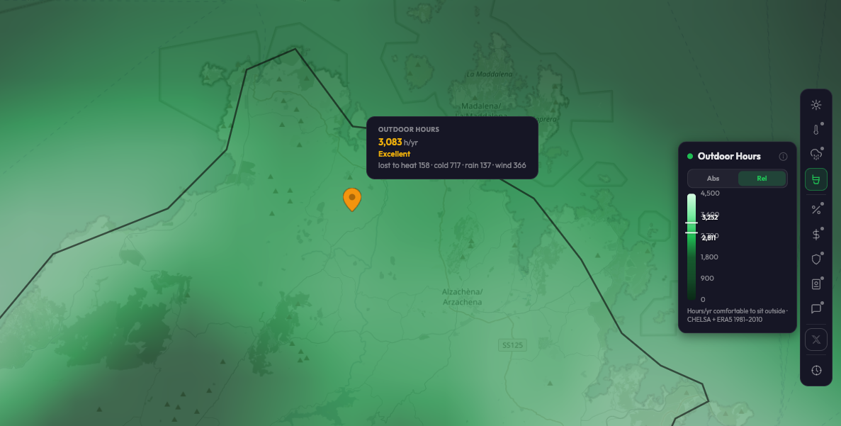
GeoRank app, Outdoor Hours layer, relative color mode — northern Sardinia (Olbia/Arzachena area). Pin breakdown: lost to heat 158 h · cold 717 h · rain 137 h · wind 366 h.
Read the breakdown chip on that pin and cold is the single largest loss category — 717 hours, more than four times the 158 hours lost to heat. That's the value of decomposing the number instead of publishing one score: a warm-climate island still has winter mornings and evenings below the 10°C apparent-temperature floor, and the daylight hours in December and January outnumber the handful of July afternoons hot enough to fail the upper bound.
How to read an Outdoor Hours pin
Every pin shows an annual hours figure plus a four-way breakdown: hours lost to heat, cold, rain, and wind. Add the comfortable count back to the four loss categories and you get roughly the total daylight hours the model evaluates across the year — in the Sardinia example, 3,083 + 158 + 717 + 137 + 366 = 4,461, which lines up with the map's 0–4,500 h/yr legend range. The rating labels are fixed thresholds on that scale — Exceptional from 3,400 h/yr, Excellent from 2,800, Good from 2,200, Moderate from 1,600, Limited from 1,000, Very limited below that — so the Sardinia pin's 3,083 lands squarely in the Excellent band.
Outdoor Hours worldwide: seven example cities
Computed from the 1981–2010 CHELSA + ERA5 climatology. Dubai fails the comfort band on heat; Singapore fails on heat combined with humidity; Reykjavik fails on cold — three different climates, three different failure modes, one comparable number. Singapore and Reykjavik land within 174 hours of each other from opposite ends of the thermometer. Figures are the sum of the twelve monthly out values in the 2026-09-06 build of cities-tools.json.
- 1Lisbon, Portugal3,464 h/yr
- 2Sydney, Australia3,387 h/yr
- 3Vancouver, Canada2,351 h/yr
- 4Manchester, UK1,991 h/yr
- 5Dubai, UAE1,704 h/yr
- 6Singapore1,186 h/yr
- 7Reykjavik, Iceland1,012 h/yr
Sunshine hours barely predict outdoor comfort (r = 0.24, n = 478)
Across all 478 cities in GeoRank's public city dataset, annual sunshine hours and annual comfortable outdoor hours correlate at r = 0.24 (95% CI 0.15–0.32) — sunshine accounts for roughly 6% of the variance in how many hours a year it is actually comfortable to be outside. The extremes make the point on their own. Lima, Peru is the least sunny city in the dataset at 1,165 sunshine hours a year — fewer than any of the other 477 — and it ranks first for outdoor comfort at 4,029 hours. Phoenix is the sunniest at 3,871 hours and ranks 209th. Bangkok gets 2.4× Lima's sunshine and one sixth of its comfortable hours.
| City | Sunshine h/yr | Sun rank | Comfortable h/yr | Comfort rank |
|---|---|---|---|---|
| Lima, Peru | 1,165 | 478 | 4,029 | 1 |
| San Diego, USA | 3,008 | 55 | 3,945 | 2 |
| Nairobi, Kenya | 2,532 | 157 | 3,871 | 3 |
| Málaga, Spain | 2,936 | 69 | 3,490 | 21 |
| Cuenca, Ecuador | 1,971 | 300 | 3,358 | 38 |
| Las Vegas, USA | 3,834 | 2 | 2,679 | 113 |
| Phoenix, USA | 3,871 | 1 | 2,372 | 209 |
| Kuala Lumpur, Malaysia | 2,392 | 197 | 721 | 472 |
| Bangkok, Thailand | 2,791 | 97 | 654 | 474 |
The reason sits in the loss breakdown. Outdoor Hours is scored on apparent temperature — the Steadman formula adds humidity and subtracts wind — so a place fails on how the air feels, not on how much sun reaches the ground. Bangkok's hottest month averages a daily high of 34.9°C against Phoenix's 42.3°C, yet Bangkok loses 3,722 hours a year to heat where Phoenix loses 1,682. Humid heat pushes apparent temperature past the 29°C ceiling for most of the daylight year even where the thermometer reads 7°C lower. Cloud cover is not what separates the top of that table from the bottom.
What the correlation does not say:
Not "sunshine doesn't matter." This is a correlation across cities, not a verdict on sunshine. Sunshine hours still drive solar yield, daylight exposure, mood, and how fast the washing dries, and they are measured far more directly than any comfort index. The narrow claim is only this: sunshine is a weak proxy for how many hours a year you can comfortably sit outside, so ranking places by sunshine alone answers a different question than most people think they are asking.
The weak global figure is geography, not noise. Split the same 478 cities by latitude and the relationship reappears where you would expect it: outside the tropics (|latitude| > 23.5°, n = 403) sunshine and outdoor hours correlate at r = 0.41, while inside the tropics (n = 75) the correlation is slightly negative at r = −0.11. Sunny-and-comfortable is a real pairing at temperate latitudes. It breaks down wherever the sun arrives with heat and humidity.
Both columns are modeled climatologies, from a city set that isn't a random sample. Sunshine is ERA5 corrected against WMO reference stations; Outdoor Hours is GeoRank's own OHI v1, a simplified half-hourly comfort model rather than a run of UTCI or TCI. Both rest on the 1981–2010 reference period. The 478 cities are large and relocation-relevant, not a random sample of the Earth's surface, so the coefficient describes this city set — it is not an estimate for every point on the map.
Reproduce it: download cities-tools.json, take sun and sum(out) for each of the 478 cities, and run a Pearson correlation over the two vectors — r = 0.238, R² = 0.057. Figures on this page were computed from the 2026-09-06 build of that file.
How to use the Outdoor Hours map
The interactive GeoRank map renders Outdoor Hours as a green gradient — the darker the swatch, the more hours per year are comfortable outside. Pan, zoom, and click any pin for the annual figure, the monthly profile, and the heat/cold/rain/wind breakdown. The same view stacks temperature, sunshine, rainfall, cost, and safety, which is closer to the real relocation question: not just "where's comfortable outside" but "where's comfortable outside and affordable and visa-accessible."
What the Outdoor Hours Index isn't
A climatology, not a forecast. Every value is computed from the 1981–2010 CHELSA reference period, not this year's actual weather. It answers "what's typical here" over three decades, not "what will next Tuesday feel like."
Personal comfort varies. The 10–29°C apparent-temperature band is a population-level model, not a measurement of any individual's tolerance. Acclimatization, clothing, shade, activity level, and personal preference all shift where your own comfort band actually sits.
Mixed resolution, disclosed. Temperature is hyper-local (~1 km, CHELSA); humidity and wind are regional modifiers (~25 km, ERA5). Two nearby locations with genuinely different microclimates can end up sharing the same rain and wind discount even where their temperature — and therefore their heat/cold split — differs.
Not the reference UTCI or TCI model. OHI is inspired by the Tourism Climate Index, the WMO's Universal Thermal Climate Index, and Kelly Norton's Pleasant Days work, but it is GeoRank's own simplified half-hourly implementation — a "UTCI-lite," not a run of any of those published models.
Related GeoRank tools & data
Frequently asked questions
Find where you can actually sit outside.
The map combines Outdoor Hours with temperature, sunshine, rainfall, cost, and safety on every pin. Set your home as the baseline and see every destination as a delta from where you live now.
Sources: CHELSA v2.1 1981–2010 climatology (temperature) · ERA5 reanalysis, Copernicus Climate Data Store (humidity, wind) · Steadman apparent temperature formula · NWS wind chill formula · Tourism Climate Index (Mieczkowski, 1985) and WMO Universal Thermal Climate Index (UTCI) cited as pedigree. Methodology and worked examples at methodology.