Tool 09 · Map · 1000+ cities
Global Temperature Map — Calibrated Annual Mean Temperatures for 1000+ Cities
An interactive world temperature map covering 1000+ cities across 190 countries. From Doha's 27°C tropical heat to Reykjavik's 5°C cold — every annual figure is the CHELSA v2.1 climatological mean, calibrated against 219 WMO reference stations and reported with documented ±1–2°C accuracy. The Temperature layer also has a monthly Daytime high · 1km mode for a sharper, present-day read.
How global temperature is calibrated
Most "world temperature map" results online return either a raw satellite layer with no station tie-in, or a Wikipedia table whose rows mix decades, station heights, and shelter types. GeoRank publishes one consistent dataset and one consistent reference period. We use CHELSA v2.1 monthly mean temperature (tas) — a terrain-informed downscaling built at ~1 km native resolution and processed to a 0.05° (~5.5 km) grid for the map — then average the twelve months of the 1981–2010 climatological normals to get one annual mean per cell.
CHELSA downscales coarse ERA5 reanalysis using dynamically-calculated lapse rates rather than one fixed global rate, so it resolves valley floors, coastal towns, and mountain ridges that a raw ~28 km reanalysis cell would flatten into one number — typical accuracy is ±1–2°C against ground stations in well-instrumented regions. We cross-check our output against 219 WMO reference stations and the national met service archives (NOAA in the US, the Met Office in the UK, DWD in Germany) to set the published accuracy bounds. The standard caveats — altitude, coastal land-sea contrast, urban heat islands — are documented in the methodology and surfaced in the layer passport below.
Daytime high · 1km — a second read on the same map
The Temperature layer now has a second mode. Flip the toggle from the annual mean to Daytime high · 1km and every pin switches to the monthly average daily maximum — the number that tells you what a June afternoon actually feels like, not what the whole year averages out to. It's built from CHELSA v2.1 tasmax climatology (1981–2010) at CHELSA's native ~1 km resolution, sharper than the map's standard 0.05° (~5.5 km) mean grid — sharp enough to keep a waterfront pin and the hills a few kilometres inland distinct instead of blended into one value.
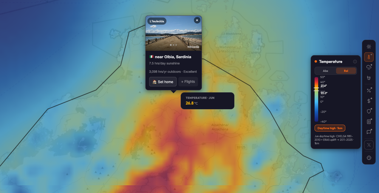
Because the 1981–2010 baseline is three decades old, Daytime high adds a warming uplift on top: the per-month change in ERA5 near-surface temperature between 2011–2025 and 1981–2010, resampled onto the 1 km grid. Globally that adds +0.4 to +0.9°C by month; fast-warming Mediterranean and continental cells run +1.2 to +1.6°C higher, while ocean-damped coasts warm less — the correction is spatially variable, not a flat offset across the map.
| City | July mean | July daytime high | Uplift |
|---|---|---|---|
| Cefalù | 26.6°C | 27.8°C | +1.2°C |
| Rome | 30.0°C | 31.4°C | +1.4°C |
| Athens | 33.1°C | 34.2°C | +1.1°C |
| Dubai | 40.7°C | 41.9°C | +1.2°C |
| London | 21.5°C | 22.2°C | +0.7°C |
Top 10 hottest cities worldwide (annual mean, calibrated)
These are the warmest major cities in the GeoRank dataset, ranked by calibrated annual mean 2-metre air temperature. Tropical capitals near the equator and oil-economy Gulf cities dominate the list. For affordable warm relocation options, the same map layers cost on top — try the cheapest countries to live ranking for the price-adjusted version of this question.
- 1Bangkok, Thailand28.5°C
- 2Manila, Philippines27.8°C
- 3Dubai, UAE27.6°C
- 4Doha, Qatar27.1°C
- 5Singapore26.7°C
- 6Mumbai, India26.6°C
- 7Miami, Florida (US)24.5°C
- 8Phoenix, Arizona (US)23.3°C
- 9Cairo, Egypt22.0°C
- 10Brisbane, Australia20.1°C
Top 10 coldest capitals (annual mean, calibrated)
- 1Reykjavik, Iceland5°C
- 2Helsinki, Finland6°C
- 3Oslo, Norway7°C
- 4Stockholm, Sweden8°C
- 5Tallinn, Estonia6°C
- 6Riga, Latvia7°C
- 7Vilnius, Lithuania7°C
- 8Moscow, Russia6°C
- 9Ottawa, Canada6°C
- 10Berlin, Germany9°C
Mediterranean & mild-climate benchmark cities
How to use the global temperature map
The interactive GeoRank map renders the calibrated temperature layer as a global orange gradient — the darker the swatch, the warmer the annual mean. Pan, zoom, and click any pin for the annual figure plus the monthly profile. The same view can stack cost, tax, sunshine, and safety, which is the real relocation question: not just "where's warm" but "where's warm and affordable and visa-accessible." The companion World Sunshine Map uses the exact same calibration discipline for sun hours.
Temperature by climate zone
Annual mean temperature alone doesn't tell you everything — a coastal Mediterranean city at 16°C and a high-altitude tropical city at 16°C feel completely different in July. Use this rough zone mapping as the mental model before drilling into specific cities. For more granular monthly data, the climate & rain layer breaks each city into its full twelve-month profile.
| Zone | Example city | Annual mean | Character |
|---|---|---|---|
| Tropical | Bangkok, Thailand | 28.5°C | Hot & humid year-round, monsoon May–Oct |
| Hot arid | Cairo, Egypt | 22.0°C | Dry heat, <30 mm annual rain |
| Mediterranean | Lisbon, Portugal | 16.3°C | Mild wet winters, dry warm summers |
| High-altitude tropical | Mexico City, Mexico | 16.1°C | Eternal spring; 6.5°C/km lapse offsets latitude |
| Oceanic temperate | London, UK | 10.6°C | Mild damp, narrow seasonal swing |
| Continental cold | Berlin, Germany | 9.4°C | Cold winters, warm summers, wider swing |
| Subarctic | Reykjavik, Iceland | 4.7°C | Cool maritime, short cool summer |
Why GeoRank's temperature map is different
Related GeoRank tools & rankings
Frequently asked questions
tasmax, 1981–2010 climatology), rendered at CHELSA's native ~1 km resolution instead of the map's standard 0.05° mean grid, plus a small warming uplift (ERA5 2011–2025 minus 1981–2010) so the number reads closer to a present-day month. It's monthly only — there's no annual Daytime high figure — and the map renders it out to zoom 7, one level past the mean layer's zoom-6 ceiling. Full breakdown in the methodology.Find your climate match.
The map combines temperature, sunshine, cost, tax, and safety on every pin. Set your home as the baseline and see every destination as a delta from where you live now.
Sources: CHELSA v2.1 climatology (WSL / University of Zurich) · ERA5 reanalysis (Copernicus Climate Data Store, EU) for the Daytime high warming uplift · 219 WMO reference weather stations · NOAA climate archives (United States) · Met Office UK (HadCRUT cross-reference) · DWD Germany · IPMA Portugal · AEMET Spain. Methodology and accuracy bounds at methodology.